 Log in
MindWare Has a New Logo!
As you may have noticed since Public Hotfix 2, MindWare has a new logo, and it's glitchy by design!
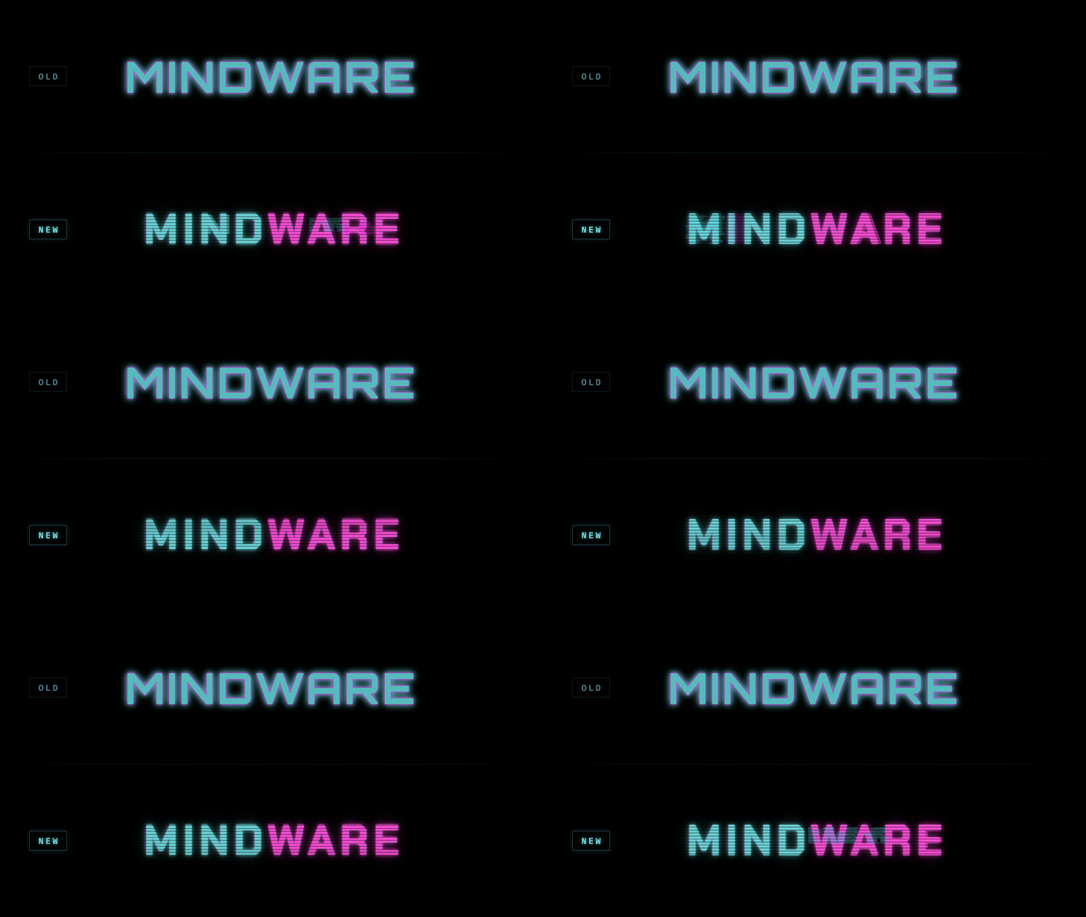
Because of how I test and play the game during development, I often jump directly into specific passages or prepared save states. As a result, I hadn’t properly visited the main menu in quite some time.
When I finally did, I was honestly a little disgusted by the unpolished logo sitting in the top-right corner. Once I started looking more closely, I also noticed misaligned social icons and several other minor presentation issues that had no place being on the first screen players see.
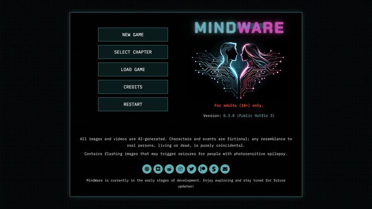
Once the new logo was finished, I decided to keep my designer hat on a little longer and finally redesign MindWare’s game-description pages on TFGames and itch.io.
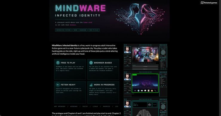
Both pages now use the updated branding, current screenshots, and a more polished structure. My own website still needs the same treatment. Fortunately, with the new branding, layouts, and updated screenshot library already finished, that should be a piece of cake... but it can wait a few weeks while I get back to working on the game itself.
So, what do you think of the new logo?



What about having the blue part fading out towards the end of mind, or blurring in to particle effects and becoming more solid in ware?
That’s a good idea! I might give it a try when I have some time to work on the implementation again.
A color gradient between the blue and pink might also look cool.